Brand & packaging / Food & Cereal
Croco Flakes — Cereal Brand & Packaging for Saudi Arabia
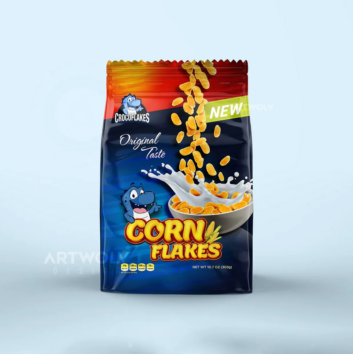
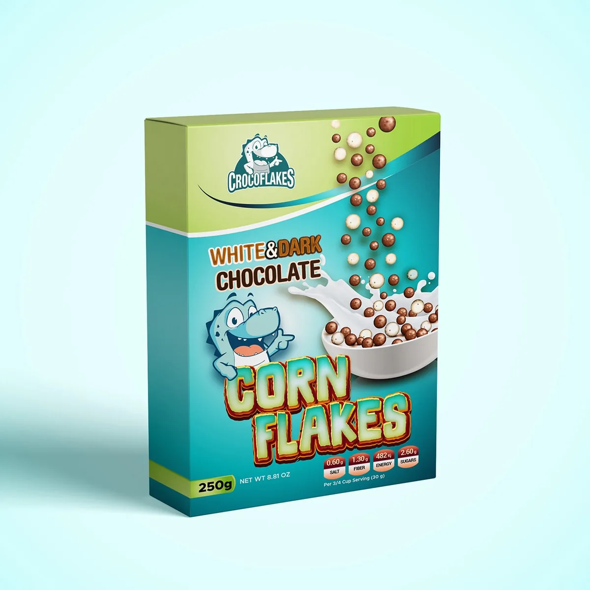
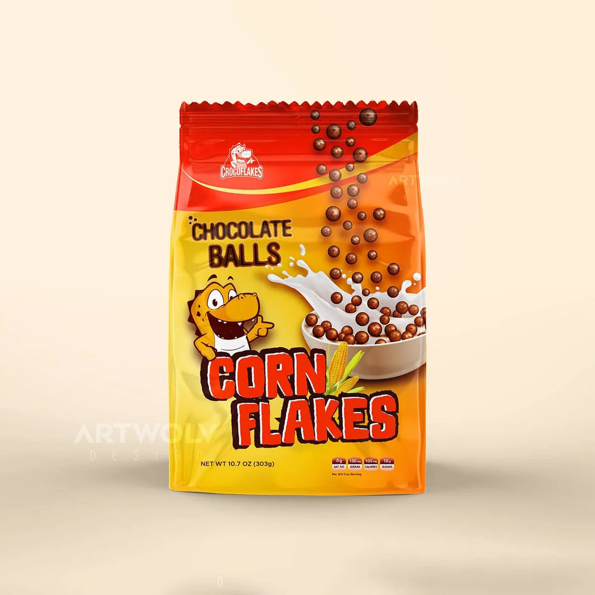
Croco Flakes entered the market as a new cereal brand with products for children and families. Because there was no inherited visual system to protect, the project could be built from the shelf backwards: recognizable mascot, fast flavour distinction and a packaging family that could grow.
- Client
- Croco Flakes
- Project
- Brand & packaging
- Year
- 2020
- Market
- Saudi Arabia
- Sector
- Food & Cereal
- My scope
- Logo design and a multi-SKU cereal packaging system
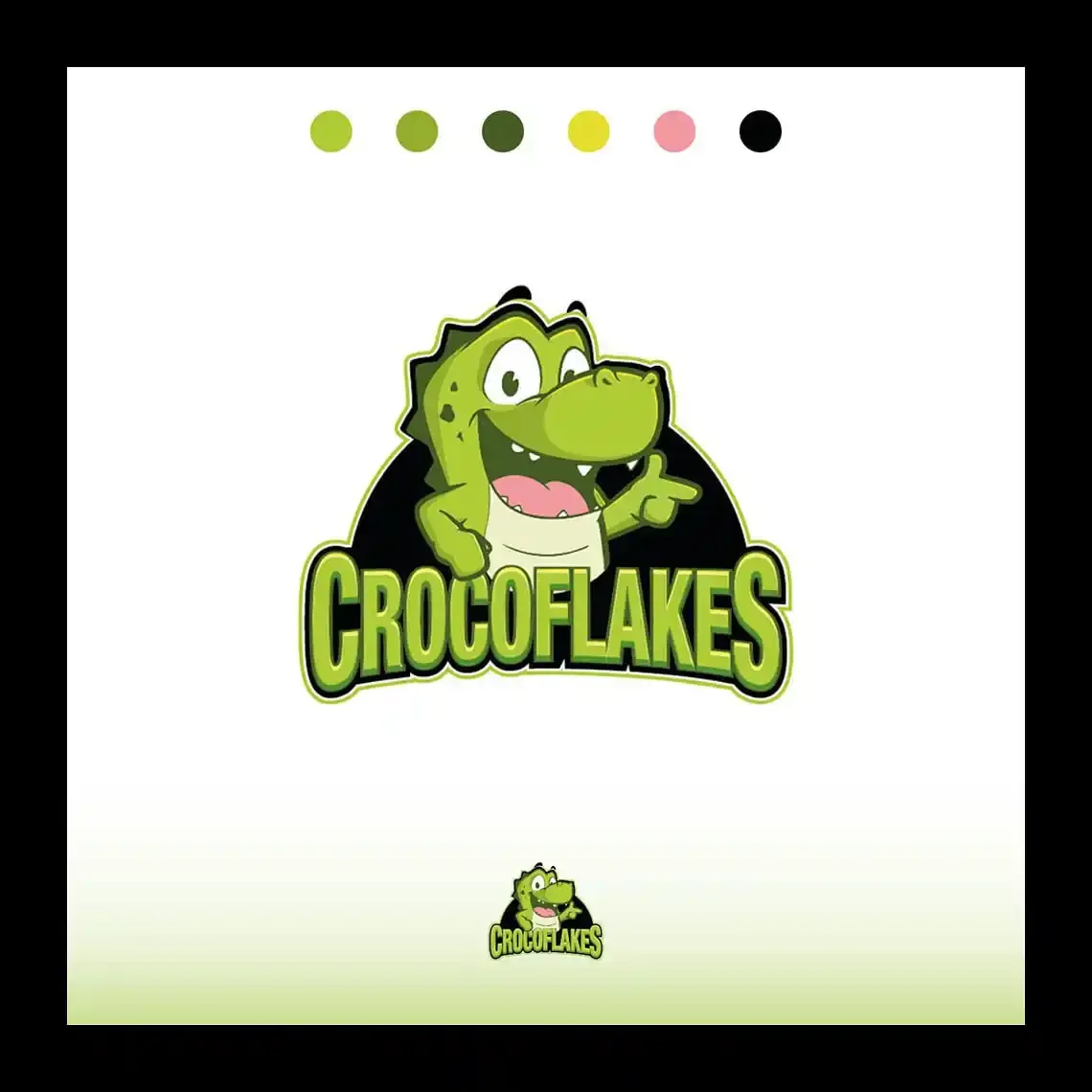
A new cereal brand needs instant shelf recognition
The crocodile character gave the range a memorable anchor while the overall composition kept the product category easy to understand from a distance.
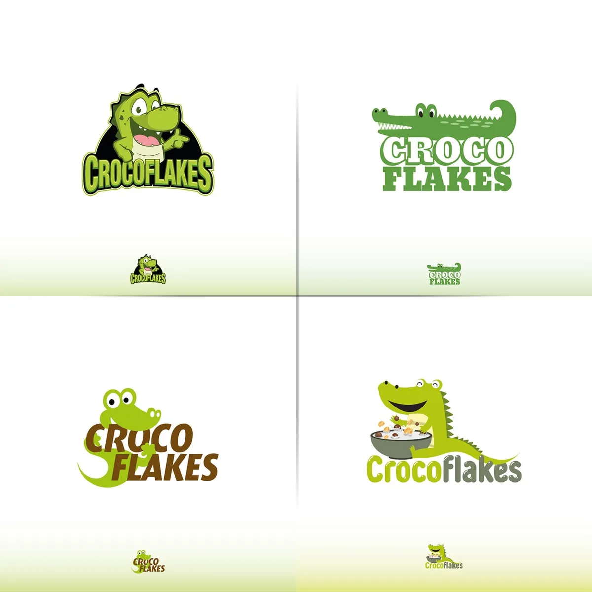
Flavours had to be different without looking unrelated
Original, chocolate and other variants use controlled shifts in colour and product imagery. The architecture stays constant so every new SKU strengthens the family instead of fragmenting it.
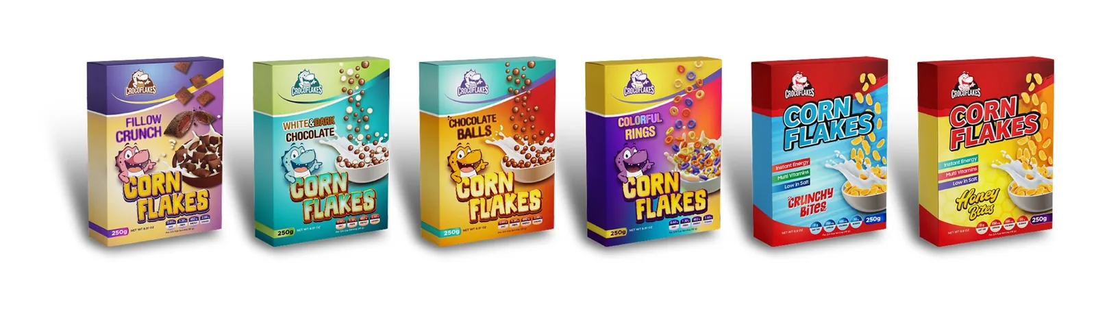
Packaging was the brand, not an afterthought
For a new FMCG product, the box is often the first serious brand encounter. Logo, product naming, flavour cues and food imagery were therefore designed as one system rather than separate pieces.
- New cereal logo and mascot direction
- Scalable packaging architecture across flavours
- Family-focused shelf communication for GCC markets
Continue through the work
More selected work
Golden Horse — Corporate Identity for Dubai Technical Services
Golden Horse Technical Services is a Dubai construction and maintenance company. The project created a practical corporate identity around a new logo, then tested…
Pet Steps — Pet Food Brand & Packaging for Saudi Arabia
Pet Steps was a new pet-food and accessories brand under Infinity International Trading, created for Saudi Arabia, Türkiye and the wider GCC. Starting from…
Mr. Scents — Fragrance Solutions Brand for Saudi Arabia
Mr. Scents provides perfume and fragrance solutions in Saudi Arabia and the UAE. The relationship started with the logo concept and expanded into a…