
Product / Web / Digital Product / Fintech
Dolari — Digital Product Landing Experience
The archived Dolari work is presented as a digital-product experience rather than a conventional company site. The interface centres the mobile product, explains the service in short steps and uses illustration and device screens to make an unfamiliar proposition easier to understand.
- Client
- Dolari
- Project
- Product / Web
- Market
- Libya
- Sector
- Digital Product / Fintech
- My scope
- Landing-page and digital-product interface presentation
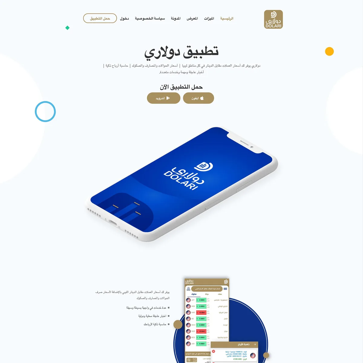
The product stays at the centre
Phone mockups and interface screens do the explaining. Supporting copy remains short so the visitor sees what the product actually looks like before reading a long feature list.
Complexity is broken into steps
Feature sections use compact blocks and visual cues to move the user through the proposition progressively rather than presenting a dense wall of product language.
A landing page should lead somewhere
The visual hierarchy keeps calls to action close to the product story, giving the page a purpose beyond simply looking like an app brochure.
- Product-led landing page
- Mobile interface presentation
- Step-based explanation and CTA structure
Continue through the work
More selected work
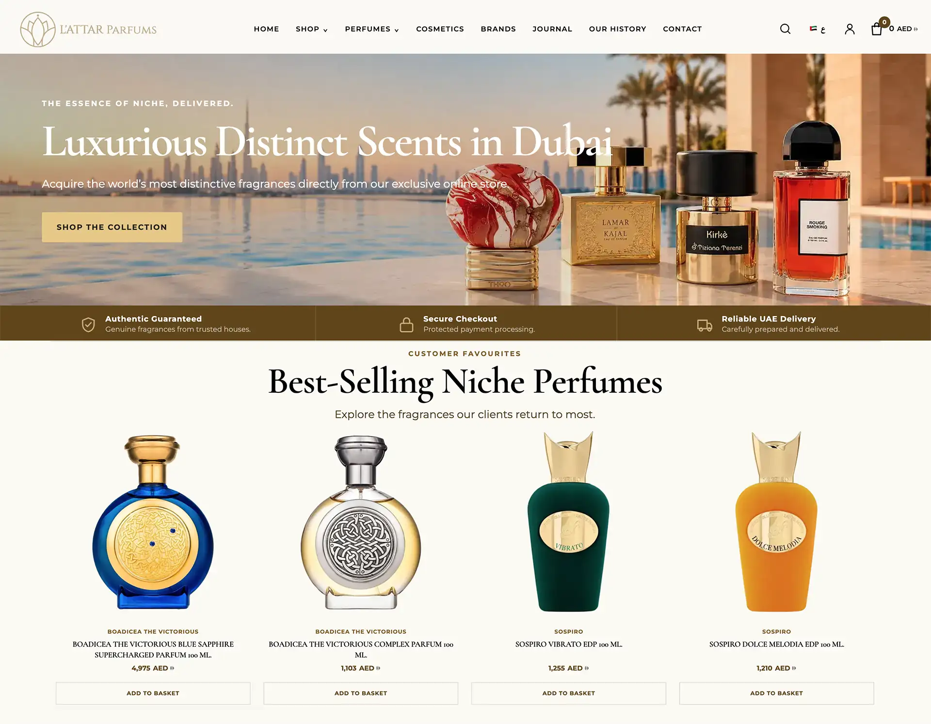
L’ATTAR Parfums — Luxury Fragrance E-commerce in Dubai
L’ATTAR needed an online store that could sell high-value niche fragrance without losing the calm, editorial atmosphere of a luxury boutique. The work combined…
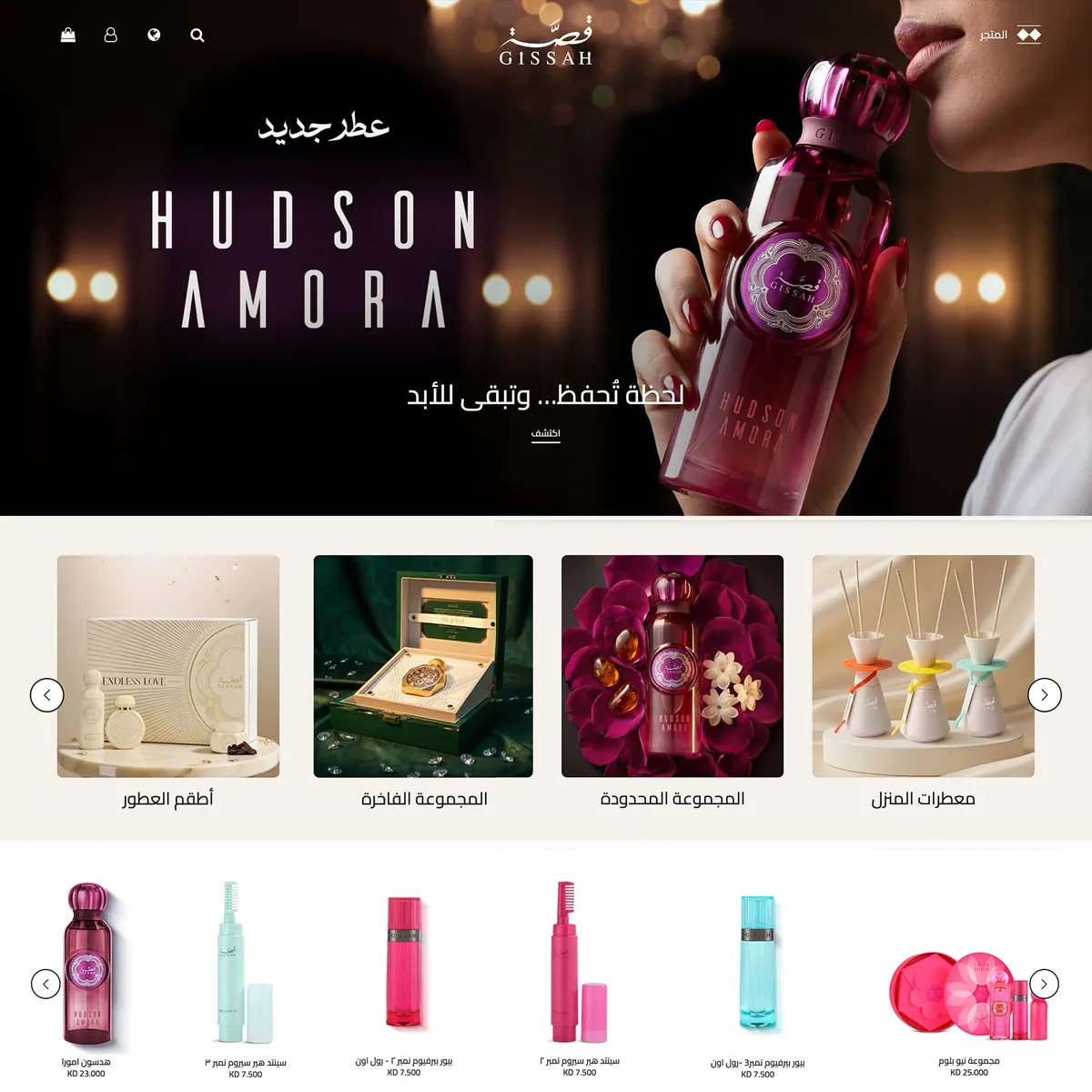
Gissah — Saudi Fragrance E-commerce Interface
Gissah is a Saudi fragrance e-commerce brand with collections spanning perfumes, body products, musk, home fragrance and gift sets. The portfolio work focuses on…
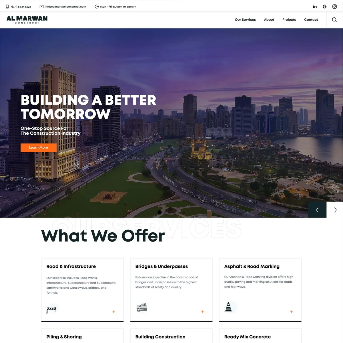
Al Marwan Construct — UAE Construction Corporate Website
Al Marwan Construct operates across road and infrastructure work, bridges, building construction, piling, asphalt and ready-mix services in the UAE. The website needed to…